Working Tools
& Materials
Every line in my work starts here with physical tools and deliberate material choices.
This page is an honest look at what I use to create each artwork, from the most precise compasses to the paper that determines how the ink breathes.

The Compass Set
Circles are the foundation of most of my compositions. I rely on a set of three compasses; each chosen to cover a specific range of scale.
Whether I'm building structural geometry at 44 cm diameter or inking minute detail under 2 cm, there's a tool for each task.
Standard Use
Day-to-Day Compass
Up to 35 cm diameter
The workhorse of the set. Handles most circle-drawing tasks across the majority of compositions, offering a reliable maximum of 35 cm diameter.
Extended Range
With Extension Arm
Up to 44 cm diameter
When compositions demand larger arcs, the extension arm pushes the same compass to a maximum diameter of 44 cm, ideal for large format works.
Detail Work
Small-Circle Compass
Under 2 cm diameter
Built specifically for precision. Used when circles fall under 2 cm diameter, the kind of intricate detail that standard compasses can't reliably hold.
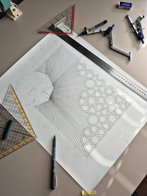
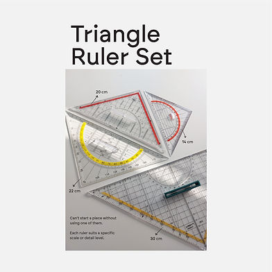
Triangle Ruler Set
I can't start a piece without reaching for one of these.
Each ruler serves a distinct purpose; the scale of a composition and its level of detail determine which I use first.
They help establish structural grids, spacing systems, perspective alignments, and geometric frameworks before the inking process begins.
Different ruler sizes are used depending on the scale and level of detail required in the composition. These construction stages often remain invisible in the final artwork, but they form the underlying structure that supports the entire piece.
14 & 20 cm Triangle Ruler
Best for small-scale compositions and fine detail work requiring tight precision.
Best for: Detail
22 cm Triangle Ruler
The mid-range workhorse sits between detail and scale, used across a wide variety of pieces.
Most Used
30 cm Triangle Ruler [Linex]
Used for larger compositions where full structural lines span the width of the paper.
Best for: Scale
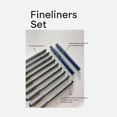
Fineliners Set
Technical fineliners are at the core of almost every artwork I create.
I use different pen thicknesses depending on the level of detail, line density, and scale of the composition. Smaller nibs allow me to build highly intricate structures and layered gradients, while thicker tips help establish stronger contrast and visual weight.
The precision of these pens is essential for maintaining consistency throughout long drawing sessions, especially in artworks that contain thousands of repetitive lines and geometric intersections.
For extremely detailed sections, even a small change in nib size can completely alter the visual rhythm and texture of the piece.
The Essential Players
Staedtler Pigment Liner
The backbone of daily inking. I use a full range of nib sizes from 0.05 mm up to 1.2 mm, so every line in a composition can be weighted precisely. Thinner lines recede; thicker lines anchor.
Best for:
Day-to-day use & detailed inking.
Technical Pens
Staedtler Mars Matic
Reserved for the most demanding detail work. These technical pens offer absolute consistency in line weight, essential when working at a microscopic scale, where even the slightest variation is noticeable.
Best for:
Very detailed & precise work.

Why so many sizes?
"Line Weight is Structure."
In geometric work, the thickness of a line isn't just visual; it defines hierarchy. Outline strokes, infill patterns, and construction marks each require a specific nib to read correctly at both close and distance.
The 0.05 and 0.1 mm nibs are for the finest infill hatching. Mid-range nibs (0.3–0.5) handle most structural lines. The 0.8 and 1.2 mm nibs anchor borders and bold geometry.
Ultra-thin technical nibs play an important role in achieving the precision required for many of my compositions.
The difference between a 0.18 mm and a 0.35 mm tip may appear subtle at first, but it significantly changes spacing, density, texture, and overall visual balance.
These smaller tools allow me to create tightly layered structures that would be impossible to achieve using standard drawing pens.
Markers & Colors
Although most of my artworks remain primarily monochromatic, I occasionally introduce pigments and markers to create contrast, reflective surfaces, or tonal variation.
Alcohol-based markers are primarily used for deep black fills due to their smooth coverage and consistent saturation. Metallic and acrylic inks are used more selectively to introduce texture, reflective qualities, and subtle material contrast within certain compositions.
I prefer using colour sparingly so the geometry and structure remain the primary focus of the artwork.
Winsor & Newton Promarker | Black
The go-to marker. All black alcohol-based ink artworks are inked with this brand. Known for its consistency and flat, rich coverage.
Go-To Option
Winsor & Newton Promarker | Color Range
While colored pieces are limited, the ink consistency across the color range makes it the preferred choice when color is introduced.
Limited Use
Why Promarker?
Consistency is non-negotiable in geometric work. The Promarker's alcohol-based ink lays flat without streaking, dries true, and behaves predictably across all the paper types I use.

Metallic Gold & Ink
Gold pigments are often layered using different brands and tones to create a richer and less uniform finish.
Depending on the paper surface and lighting conditions, the same ink can appear matte, reflective, muted, or highly saturated. I often experiment with combinations of metallic inks to achieve more balanced and controlled tonal variations.
Reflective inks are usually introduced in small areas to create subtle shifts in light and surface interaction.
Pilot Super Color Gold
Used for most gold-inked artworks. Paired with other brands to achieve varied gold tones across a single piece.
Gold Works
Molotow ONE4ALL | Acrylic Ink
A recent addition. Used in some artworks for a richer, deeper black than alcohol-based inks can achieve. The acrylic base creates a distinct surface quality.
New
Molotow Liquid Chrome
The newest addition to the set. A uniquely reflective ink, a mirror-like surface that adds a completely different dimension to recent artworks.
New [Reflective]
Achieving the right gold tone isn't a single-marker job. The Pilot Super Colour Gold forms the base and is layered with other brands to shift warmth and depth; darker for richness, lighter for luminosity. Each gold artwork involves a slightly different combination.


Paper Surfaces and Texture
Paper selection plays a major role in how each artwork develops.
Texture, absorbency, thickness, and surface finish all influence how ink settles, reacts, and reflects under light. Some papers allow for sharper linework and cleaner intersections, while others create softer textures and more visible material interaction.
I use different paper types depending on the intended atmosphere and technical requirements of the composition.
In many cases, choosing the right surface becomes just as important as choosing the right drawing instrument.

Frequently Used Papers
Fuego Matt
Heaviest in the regular set. Substantial, smooth & minimal bleed.
285 gsm
Gmund Matt
Reliable matte surface with clean ink absorption.
200 gsm
Conqueror
Slightly textured. Adds a natural, tactile quality to printed works.
220 gsm
Fabriano Elle Erre
Fine laid texture, beautiful with both fineliner and marker.
220 gsm
Canvas Wit
Canvas-like grain. Ink sits differently, slightly more organic result.
200 gsm
Lino Wit
Fine grid texture. Subtle pattern that can interact with the artwork geometry.
200 gsm
Marmor
Marble-effect surface. Used selectively for specific aesthetic results.
200 gsm
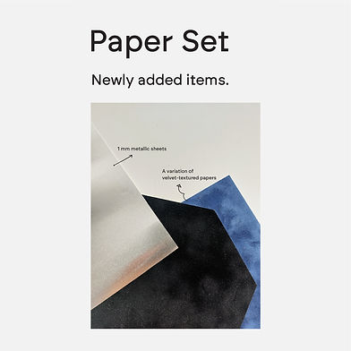
Experimental Materials
Alongside traditional paper surfaces, I occasionally experiment with alternative materials and speciality textures.
Metallic sheets, velvet-textured papers, and reflective surfaces introduce different tactile qualities and light behavior that can dramatically change the visual atmosphere of an artwork..
Experimentation allows me to expand the material possibilities of the compositions while still maintaining the precision-based nature of the work.
Surface Expansion
1 mm Metallic Sheets
Rigid metallic sheets that take ink in an entirely new way.
The reflective surface creates an effect impossible to achieve on standard paper.
Texture Exploration
Velvet-Textured Papers
A variation of velvet-finish papers in different colours.
The soft, almost tactile surface produces a depth and richness that smooth papers can't replicate.
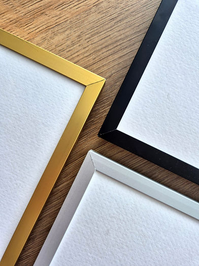
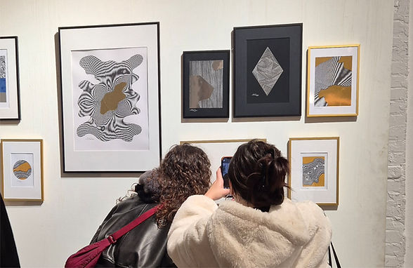
Presentation & Display
The way an artwork is displayed influences how it is experienced.
I generally prefer simple presentation methods that preserve focus on the composition itself. Clean lines, balanced spacing, and minimal materials help maintain the clarity and precision of the work while allowing the geometry to remain the primary focal point.
Most pieces are presented with a passe-partout, creating visual separation between the artwork and its surroundings while emphasising depth and negative space.
Artworks are also available unframed, offering collectors the flexibility to adapt the final presentation to their own space and style.
Presentation
Principles
-
Passe-partout mounting
-
Minimal profiles
-
Lightweight display solutions
-
Available framed or unframed